Unit 09: Data Science
Exploring Data and How It’s Gathered
1. What is the difference between qualitative and quantitative data?
Qualitative Data
Information that describes qualities or characteristics. It is not measured in numbers, but uses words or labels. This type of data helps us understand what something is like.
Example: The color of your shirt, the type of music you like, the names of your friends.
Quantitative Data
Data that is all about numbers. It tells us how much, how many, or how often something happens. This data is used when we need to measure or count something.
Example: Your age, your height, the number of students in a class.
2. Give an example of continuous data and explain why it is considered continuous.
Continuous data consists of values that can take any number within a given range, including fractions or decimals. It’s “continuous” because the values can be measured to an ever-finer degree.
Examples:
- Student heights (150.5 cm, 160.2 cm)
- Fruit weights (1.5 kg, 2.2 kg)
- Room temperature (22.5 °C)
3. Which method would you use to collect opinions from a large group of people about a new school policy?
Questionnaires are an effective method. They are similar to surveys but are often written forms that people fill out. They usually have a set of questions that need to be answered, making it easy to collect consistent data from a large group.
4. What type of data is the number of students in your class?
The number of students in your class is quantitative (numerical) data. Specifically, it is discrete data because it represents a countable quantity (you can’t have half a student).
5. Why is it important to organize data into tables or charts before analyzing it?
Proper organization saves time and makes data easier to understand. When data is organized into tables or charts, it is much easier to find specific information, see patterns, and perform analysis. It’s like the difference between searching for a book in a messy room versus a neatly arranged bookshelf.
6. What is one advantage of using online tools like Google Forms for collecting survey data?
A major advantage is ease of use and accessibility. Google Forms is a free tool from Google that helps you create surveys and collect responses online automatically, saving time and reducing manual data entry.
Explore Google Forms →7. Why might you need to integrate data from different sources when working on a project?
Data integration involves combining information from different sources to get a more complete and accurate perspective. By merging data, you can find common themes and build a stronger, more comprehensive understanding of a topic.
8. Describe a scenario where discrete data might be more useful than continuous data.
When a school organizes activities and wishes to track the number of students who attend each one, discrete data is more relevant. You need to know the exact count of students (e.g., 25, 30, 42), not a continuous measurement. This helps in resource planning and attendance tracking.
9. Explain why data visualization is important. How does it help in understanding complex information?
Data visualization is important because it makes understanding data much easier and faster. Trying to interpret a list of hundreds of numbers is difficult, but when those numbers are displayed as a graph or chart, it becomes much easier to see patterns, trends, and outliers at a glance.
10. Describe what a line graph is used for and provide an example.
A line graph is a data visualization tool that depicts information in a graphical format by connecting data points with lines. It is primarily used to show trends or changes over a period of time.
Example:
A chart displaying the number of students who attend school each day for a week. The line would show whether attendance is increasing, decreasing, or staying stable over the week.
11. Explain the use of scatter plots in visualizing continuous data. Provide an example.
A scatter plot is a useful tool for displaying the relationship between two numerical variables. Each dot on the plot represents a single data point. It helps in recognizing patterns like a positive association (both variables increase together), a negative association (one increases as the other decreases), or no association.
Example:
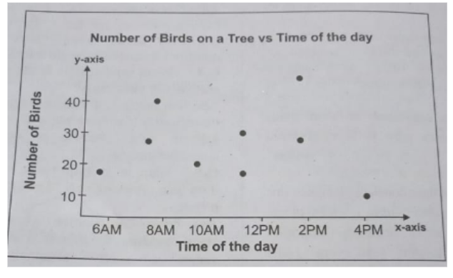
A scatter plot showing the relationship between the time of day and the number of birds on a tree.
Pingback: Long Question Answers: Data Science and Data Gatherin -